What is the CRI of an LED and why does it matter? This question appears simple, yet it affects how people see food, skin, fabrics, artwork, and product colors. Color Rendering Index, or CRI, measures how accurately a light source reveals colors compared with a reference source. A higher CRI usually creates more natural-looking colors. However, CRI should not be treated as a complete quality label.
Lighting researcher Dr. Kevin Houser has stated, “CRI is not a complete measure of color quality.” That warning matters in real spaces. An LED marked CRI 90 may still make red clothing look dull if its R9 performance is weak. A kitchen counter can appear clean under one lamp and slightly gray under another. The objects have not changed. The spectrum has.
CRI can guide decisions, but it cannot replace observation. Homeowners may value warm, comfortable light, while retailers need accurate merchandise colors. Museums, studios, restaurants, and healthcare spaces require even closer attention. Color temperature also matters. A 2700K LED and a 5000K LED can show similar CRI values while creating very different visual moods.
This article examines what CRI measures, where its limits appear, and how to compare LEDs more intelligently. It also considers TM-30, R9, flicker, and color temperature. The numbers help. They do not think for you. A practical test beside familiar objects may reveal problems that a product box hides. That is an imperfect method, but sometimes it is the honest one.
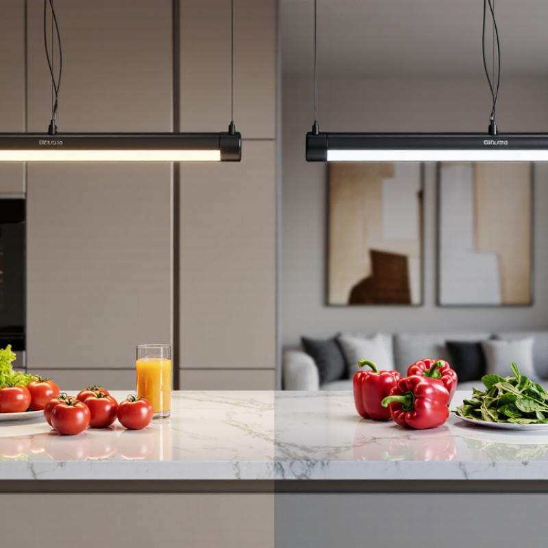
Color Rendering Index (CRI) describes how accurately a light source shows colors compared with a reference light. It is usually shown on a scale from 0 to 100. A higher score generally means colors look more natural, but CRI is not a complete description of light quality. The standard score averages eight color samples and does not include saturated red, a color that can matter for skin, food, and fabrics. That matters.
In a kitchen, a red tomato may look lively under one lamp and dull under another, even when both lamps have similar brightness. CRI can help explain the difference. Yet two lights with the same CRI may still make colors look different because their spectra and color temperatures vary. A score above 90 is often useful where accurate color judgment matters, such as dressing areas or art spaces, but it does not guarantee pleasing light. Personal preference counts, too.
Tips: Compare lights at a similar color temperature, and view familiar objects under each one. Check whether the specifications report R9 alongside CRI, especially if rich reds matter. If possible, test a sample in the actual room; paint and fabric can shift noticeably under different lighting.
Color Rendering Index (CRI), often reported as Ra, describes how accurately a light source renders colors compared with a reference light. Higher scores generally mean more faithful color appearance.
How to read this chart: Bars show approximate typical CRI ranges, not guaranteed values. Many people use CRI 80+ as a general indoor-lighting guideline and choose 90+ when color accuracy is especially important, such as for art, clothing, or detailed tasks. Actual CRI varies by lamp, and CRI alone does not describe every aspect of color quality.
CRI, or Color Rendering Index, estimates how faithfully a light source reveals colors compared with a reference illuminant of similar color temperature. The common Ra score averages eight test colors, labeled R1 through R8. It leaves out saturated red, R9, which can matter when evaluating skin tones, food, or artwork. That omission is easy to miss.
In standardized testing, the test source and reference illuminate color samples at matched color temperatures. Measured color differences are converted into scores, with 100 representing the reference. A higher Ra generally means closer color fidelity. An Ra of 80 is a common baseline for many indoor spaces; detailed retail displays or art settings may benefit from 90 or higher. Still, the number has limits. Two LEDs with the same Ra can render a red tomato or blue fabric differently. Check R9 or fuller metrics such as TM-30 when those colors matter. CRI measures fidelity, not whether a room feels warm, bright, or pleasant. I’d treat it as a useful clue, not a verdict. Even comparing samples in the room can be imperfect: a beige wall may tint the light you think you’re judging.
CRI, or Color Rendering Index, describes how faithfully a light source reveals colors compared with a reference source. A higher CRI often makes familiar objects look more natural. Under good-quality lighting, skin tones may appear less gray, ripe tomatoes look vivid, and the blue in a fabric swatch is easier to judge. Small differences matter.
CRI is useful, but it is not the whole story. Two lamps with the same CRI can still render certain colors differently because the score averages results across a set of test colors. насыщенность? Need no typo. Some deep reds may look dull even when the overall CRI is high. The R9 value can help reveal how well a source renders saturated red, which matters in settings such as kitchens, galleries, and makeup areas. Color temperature also affects the mood of a scene, though it does not measure color accuracy by itself.
When choosing lighting, compare objects under the actual lamp, not only on a specification sheet. A red apple, a skin-tone reference, or a paint sample can expose differences quickly. I find this practical check easy to overlook. It is not a laboratory test, of course, but it can show whether the light suits the room and its tasks.
CRI, or Color Rendering Index, estimates how faithfully a light source shows colors compared with a reference light. Ratings run from 0 to 100. A higher score generally means colors look more natural, but the number cannot describe every color equally well.
For hallways, storage rooms, and other practical spaces, LEDs rated around CRI 80 or higher are often adequate. Skin tones, food, and fabric can look a little dull under lower-rated lighting. That is noticeable.
In kitchens, clothing shops, art studios, or makeup areas, CRI 90 or above can reveal richer reds and more lifelike color differences. A red sweater beside an orange one is easier to judge.
Still, a high CRI is not a guarantee of perfect color. The rating summarizes selected color samples, so two LEDs with similar scores may render certain shades differently. Red is a useful example: the R9 value provides extra information about saturated reds, which the general CRI score does not fully capture. It is easy to overvalue one number. Consider the task, the room’s finishes, and how the light feels at the time of day. Color preference is partly subjective, and a technically higher score may not be worth extra cost in every space.
Choose CRI according to what people and objects need to look like. For hallways, storage areas, and utility rooms, CRI 80 or above is often a practical baseline. For kitchens, living rooms, and clothing shops, CRI 90 or above can reveal more natural skin tones, fabrics, and food colors. Check the actual surfaces under the fixture: a red sweater or ripe tomato can look dull under lighting with weak red rendering. Small differences matter.
CRI is useful, but it is not the whole picture. The CIE’s standard color-rendering method, CIE 13.3, calculates the general CRI (Ra) from eight test colors. The Illuminating Engineering Society’s TM-30 method evaluates 99 color samples and reports fidelity and gamut measures, offering a broader view of color shifts. Ask for TM-30 data when color accuracy is important, such as in a studio or gallery. Also compare color temperature and test the lamp in the room; a high CRI alone cannot guarantee a pleasing result. Numbers help. Your eyes still matter. I would not choose from a specification sheet without seeing the light on the actual materials.
| CRI (Ra) Range | Typical Color Appearance | Suitable Uses | How to Choose | Important Considerations |
|---|---|---|---|---|
| Below 70 | Colors may look noticeably less natural or harder to distinguish. | Some utility, industrial, or outdoor applications where accurate color recognition is not a priority. | Consider this range only when color appearance is secondary and the lighting meets the task’s other requirements. | It may be unsuitable where people need to judge colors, read color-coded information, or see skin tones clearly. |
| 70–79 | Generally functional color rendering, with less accurate color distinction than higher-CRI lighting. | Garages, warehouses, service areas, and some general-purpose outdoor lighting. | Choose it for practical spaces where budget or light output is a priority and precise color judgment is not required. | Check local requirements and the specific task; CRI alone does not indicate brightness, efficiency, or overall light quality. |
| 80–89 | Good everyday color rendering for many common environments. | Living spaces, offices, classrooms, kitchens, corridors, and general retail areas. | A useful starting point for general-purpose indoor lighting when colors should look reasonably natural. | Two lamps with the same CRI can still render individual colors differently. Compare samples where appearance matters. |
| 90–94 | Very good color rendering, often with more natural-looking colors and skin tones. | Bathrooms, salons, clothing shops, galleries, hospitality spaces, and detailed home tasks. | Choose this range when color fidelity noticeably affects comfort, appearance, or product presentation. | Review the lamp’s spectrum and, when available, its R9 value for saturated reds; the general CRI score does not fully describe every color. |
| 95 and above | Excellent color rendering under the conditions used for the measurement. | Color assessment, photography and video work, art studios, high-end retail, and other color-critical settings. | Use when accurate color evaluation is important, and test the light in the actual space before making a final choice. | High CRI does not guarantee a perfect match to daylight or another lamp. Also consider color temperature, consistency, flicker, and light distribution. |
What CRI means: The Color Rendering Index (CRI) estimates how accurately a light source renders colors compared with a reference light source of a similar color temperature. The commonly quoted general CRI value, Ra, averages results for eight test colors and does not include the saturated-red test color R9. CRI is useful for comparison, but it does not measure brightness, energy efficiency, or every aspect of perceived color quality.
CRI estimates how faithfully a light shows colors compared with a reference light. Scores usually range from 0 to 100. Higher is generally better.
Not always. CRI measures color fidelity, not warmth, brightness, or personal preference. A high score can still feel harsh or unappealing.
Around CRI 80 or higher is often adequate for practical spaces. For finding a box on a shelf, a higher score may not matter much.
It can help in kitchens, dressing areas, art spaces, and clothing shops. A red sweater beside an orange one may be easier to judge.
R9 measures saturated red, which the common CRI average leaves out. It can matter for skin tones, tomatoes, and red fabrics. Easy to overlook.
Yes. Their spectra and color temperatures can differ, so a blue fabric or tomato may look different under each light.
Compare them at similar color temperatures and view familiar objects under each. If possible, test a sample in the actual room. Paint can shift.
It is a useful clue, not a verdict. Check R9 or fuller metrics when specific colors matter. I might still trust a room test more, though the wall color can influence what I see.
What is the CRI of an LED and why does it matter? The Color Rendering Index (CRI) describes how accurately a light source reveals colors compared with a reference light source. It is commonly expressed on a scale from 0 to 100, with higher scores generally indicating more natural-looking colors. A standard CRI rating averages how a light renders a set of test colors, offering a useful guide, though it does not capture every aspect of color quality or personal preference.
CRI matters because lighting can affect how people see objects, finishes, food, and skin tones. Lower-CRI lighting may make colors appear muted or different from their appearance in daylight, while higher-CRI lighting can support greater color accuracy. The right rating depends on the application: everyday spaces may work well with a moderate CRI, while places where color judgment is important often benefit from a higher one. When choosing LED lighting, consider the room’s purpose, the colors you want to reveal, and the balance between visual quality and practical needs.

Zever Light